In Chap. 9, we focused on within-sample (alpha) diversity. In this chapter, we focus between-sample (beta) diversity metrics and their ordination. Beta diversity measures the difference between two samples or communities. When we conduct beta diversity analysis, a distance or dissimilarity measure matrix is required. This chapter is organized this way. Section 10.1 introduces abundance-based beta diversity metrics. Section 10.2 introduces phylogenetic beta diversity metrics. Section 10.3 introduces ordination methods and ordination plots. Section 10.4 introduces beta diversity metrics and ordination in QIIME 2. In Sect. 10.5, we conduct some general remarks on ordination and clustering. Finally we briefly summarize this chapter in Sect. 10.6.
10.1 Abundance-Based Beta Diversity Metrics
Beta diversity measures the difference between two communities or samples. Like alpha diversity, we can group beta diversity metrics into two categories: abundance-based beta diversity dissimilarity and phylogenetic beta diversity dissimilarity. So far there are more than two dozens of beta diversity measures available in the literature of ecology (Koleff et al. 2003; Jari Oksanen and Tonteri 1995), of which the abundance-based dissimilarities Bray-Curtis index (Bray and Curtis 1957), Jaccard index, and Sørensen index are most commonly used and adopted for microbiome studies. Several phylogenetic beta diversity metrics have been specifically proposed for microbiome data including unweighted/weighted UniFrac distances (Lozupone and Knight 2005; Lozupone et al. 2007) and generalized UniFrac distances (Chen et al. 2012).
We can also categorize the beta diversity indices into two broad classes of similarity measures: binary similarity coefficients and quantitative similarity coefficients. Binary similarity coefficients only measure the presence/absence data that are available for the species in a community, whereas quantitative similarity coefficients measure the relative abundance that are available for each species.
The methods for estimating alpha diversity are fairly straightforward. In contrast, measurement of beta diversity is controversial (Ellison 2010), because some beta diversity measures are designed solely to determine whether communities are significantly different and others are to measure the distance between pairs of communities that satisfy the requirements of a distance metric. For example, Jaccard and Bray-Curtis coefficients measure the distance between communities based on the species that they contain (Lozupone and Knight 2005). The key point to selecting a proper measure of beta diversity is based on microbiome hypothesis testing and the methods that must be tailored to the hypothesis, rather than vice versa.
The measures of beta diversity typically are not reported alone. In contrast, the matrices are used as inputs in the functions of ordination plots and hypothesis testing. But they can be calculated independently in some software. For example, Koleff et al. (2003) reviewed 24 indices of beta diversity including Bray-Curtis index, Jaccard index, and Sørensen index (Koleff et al. 2003). All commonly used indices can be found using betadiver() function in the BiodiversityR package. The function betadiver() for indices of beta diversity in the community ecology package vegan (vegan function vegdist()) can directly calculate any of the 24 indices of beta diversity. Xia et al. illustrated the calculations of Bray-Curtis index, Jaccard index, and Sørensen index via the vegan package in their book (Xia et al. 2018a). QIIME 2 can calculate unweighted UniFrac and weighted UniFrac distances. GUniFrac can calculate generalized UniFrac distances as well as unweighted UniFrac and weighted UniFrac distances. While we reported each measure of alpha diversity in Chap. 9, for beta diversity in this chapter, we focus on introductions of the most commonly used beta diversity measures and their calculation as inputs of matrices for the functions of ordination. These beta diversity measures can also be used for statistical hypothesis testing in Chap. 11.
10.1.1 Bray-Curtis Dissimilarity
Bray-Curtis index of dissimilarity (Bray and Curtis 1957), a distance measure of matrix, was developed and named after J. Roger Bray and John T. Curtis. It is the most widely used beta diversity in ecology and microbiome research fields. The Bray-Curtis coefficient has been evaluated to be one of the most reliable performers in terms of robustness in a simulation study (Faith et al. 1987).
10.1.1.1 The Measures of Bray-Curtis Index
Bray-Curtis dissimilarity was developed based on counts at each sample to quantify the compositional dissimilarity between two different samples; that is to measure the relative abundances of species. For microbiome abundance data, the measures of distance coefficients are not really distances. They actually measure “dissimilarity.” So we call Bray-Curtis index as distance (dissimilarity) coefficients.
For the simplest case, there are two species in two community samples. The smaller the distance, the more similar the two communities are. When a distance coefficient is zero, the two communities are identical. The intuitively appealing feature of distance coefficients (although they are not really distances in microbiome case) for the microbiome researchers is that they can be visualized. Euclidian, Manhattan, and Bray-Curtis coefficients all measure the distance (dissimilarity). The formula of Euclidian distance is given as below:


Bray-Curtis dissimilarity was defined based on Euclidean distance. The formula of Bray and Curtis’ dissimilarity index is given as follows:

It ignores cases in which the species is absent in both community samples. Therefore, Bray-Curtis measure is not affected by joint absences and is sufficiently robust for marine ecology data (Field and McFarlane 1968).
It gives more weight to abundant species than to rare ones and hence is dominated by the abundant species so that rare species add very little to the value of the coefficient. This property has been reviewed intuitively by most ecologists (Field et al. 1982).
10.1.1.2 Calculating Bray-Curtis Index Using the vegan Package
In Chap. 9, we used this dataset to illustrate calculation of alpha diversity (Zhang et al. 2020). Here, we continue to use this dataset to illustrate calculation of beta diversity.
The vegdist() function is used to compute dissimilarity indices that are most commonly used by community ecologists. All indices use quantitative data, and the binary index can be calculated using an appropriate argument. One syntax of the vegdist() function is given as below:
x is the community data matrix.
method is used to specify the dissimilarity index, such as “bray” and “jaccard.”
binary is used to specify performing presence/absence standardization before analysis using decostand()function.
diag is used for computing diagonals.
upper is used for returning only the upper diagonal.
na.rm is used to specify pairwise deletion of missing observations when computing dissimilarities.
The R package vegan (current version 2.5.7, March 2022) is a community ecology package. This package provides tools for descriptive community ecology; it has most basic functions of diversity analysis, community ordination and dissimilarity analysis for community ecology, and other data types as well (Jari Oksanen et al. 2020), such as microbiome data. The following R commands calculate Bray-Curtis dissimilarity via the vegdist() function in vegan package:
10.1.2 Jaccard Dissimilarity
Jaccard index, developed by the vegetation scientist Paul Jaccard in 1900 (Jaccard 1900), is the first similarity coefficient used to analyze vegetation survey data, and nowadays this coefficient is still in wide use in all fields including ecology and microbiome to analyze multivariate presence/absence observational data.
10.1.2.1 The Measures of Jaccard Index
A 2 × 2 contingency table for defining beta diversity
Sample A | |||
No. of species present | No. of species absent | ||
Sample B | No. of species present | a | b |
No. of species absent | c | d | |
where a is the number of species in sample A and sample B (joint occurrences), b is the number of species in sample B but not in sample A, c is the number of species in sample A but not in sample B, and d is the number of species absent in both samples (zero-zero matches). The Jaccard index is given as below:

Jaccard’s dissimilarity coefficient is defined as 1 − Sj via this similarity.
10.1.2.2 Calculate Jaccard Index Using the vegan Package
Jaccard’s index can be calculated using the vegdist() function in vegan package as below:
Please note that specifying “jaccard” in the function vegdist() returns Jaccard similarity instead of Jaccard dissimilarity. The Jaccard dissimilarity is obtained by 1 − Sj (i.e., 1 − jaccard).
Bray-Curtis and Jaccard indices are rank-order similar. The vegdist() function by default uses Bray-Curtis which is semimetric. Based on the vegan manual, it probably should be preferred using the metric Jaccard index instead of the default semimetric Bray-Curtis index. Jaccard index is computed as 2BC / (1 + BC), where BC is Bray-Curtis dissimilarity. However, the quantitative version of Jaccard should probably be called Ružiˇcka index (Jari Oksanen 2020, pp. 273–277). Thus, we specify binary=TRUE in the vegdist() function to obtain the binary version of Jaccard index.
10.1.3 Sørensen Dissimilarity
10.1.3.1 The Measures of Sørensen Index

The Sorensen and Jaccard coefficients are thought as very closely correlated (Baselga and Orme 2012). The range of all similarity coefficients for binary data is supposed to be 0 (no similarity) to 1 (complete similarity). In fact, this is not true for all coefficients.
 (Tuomisto 2010), which is given as below:
Subtraction of one means that β = 0 when there are no excess species or no heterogeneity between samples. A drawback of above formula is that S increases with sample size, but α is expected to be constant, so the beta diversity increases with sample size. This really caucuses problem in ecology and also microbiome studies. Thus, to overcome this drawback, Whittaker suggested using pairwise comparison of samples to find the index (Whittaker 1960), i.e., to study the beta diversity of pairs of sites or samples (Marion et al. 2017). The new index is called the Sørensen index of dissimilarity, which is given as below:

 is the average richness per one sample S = a + b + c.
10.1.3.2 Calculate Sørensen Index Using the vegan Package
The Sørensen index of dissimilarity can be calculated for all samples using vegan function vegdist() with argument binary = TRUE for suggesting binary data:

After we obtain Bray, Jaccard, and Sørensen diversity indices, we can conduct hypothesis testing and statistical analysis on them. Typically, these dissimilarity matrices can be analyzed by a multivariate technique such as analysis of similarities (ANOSIM) or permutational MANOVA (PERMANOVA) (see Chap. 11 for details).
10.1.3.3 Calculate Matrices of Bray-Curtis, Jaccard, and Sørensen Indices Using the vegan Package
As illustration, the following R commands calculate Bray-Curtis, Jaccard, and Sørensen indices together:
The calculation of distance/dissimilarity matrices mainly involves two packages: matrixStats and vegan. The matrixStats (current version 0.61.0, March 2022) package was developed to provide high-performing functions operating on rows and columns of matrices (and to vectors) (Bengtsson 2020).
10.2 Phylogenetic Beta Diversity Metrics
Multivariate analyses of microbial communities typically first need one distance metric to measure distances or dissimilarities between microbial communities and then to conduct comparisons based on the measurements.
The unique fraction (UniFrac distance) metrics, the phylogenetic distance measures, which account for the phylogenetic relationship among the taxa, are very powerful methods because they exploit the degree of divergence between different sequences. UniFrac distance metrics are often used to summarize the overall microbiota variability. In this subsection, we introduce three phylogenetic beta diversity metrics (unweighted UniFrac, weighted UniFrac, and GUniFrac) that were specifically developed for microbiome data.
10.2.1 Unweighted UniFrac
In 2005, UniFrac distance metric (Lozupone and Knight 2005), a phylogenetic-based method, was proposed to measure the phylogenetic distance between sets of taxa in a phylogenetic tree, taking the natural hierarchical structure of the data into account. UniFrac distance metric aims to enable objective comparison between microbiome samples from different conditions. UniFrac does not rely on statistical testing for differences in each individual taxon; instead it directly conducts statistical hypothesis testing of two samples by comparing the taxonomic distance between the sets of taxa from each sample (Lozupone and Knight 2005).

 and
and  denote the cumulative proportions of all taxa descending from the ith branch for communities A and B, respectively. I(⋅) is the binary indicator function. Because of the probability that the rare taxa sequenced are directly related to the presence/absence of species, thus the unweighted UniFrac could most efficiently detect the variability in community membership or the abundance of rare lineages (Chen et al. 2012). However the drawback of the unweighted UniFrac distance is that it may have lower power in detecting change in moderately abundant lineages (Chen et al. 2012).
10.2.2 Weighted UniFrac

Unweighted UniFrac distance considers only species presence and absence information and counts the fraction of branch length unique to either community. In contrast, weighted UniFrac distance uses species abundance information and weights the branch length with abundance difference. Thus, the weighted UniFrac is most sensitive to detect change in abundant lineages. However, like unweighted UniFrac, the weighted UniFrac distance may be underpowered in detecting change in moderately abundant lineages (Chen et al. 2012).
10.2.3 GUniFrac

 denotes the distance with α = 0.5 which overall has been shown to be very robust and can efficiently capture the microbiota variability in the moderately abundant lineages.
10.2.4 pldist
The pldist (paired and longitudinal UniFrac ecological dissimilarity) method (Plantinga et al. 2019) is another approach of distance-based analysis. The goal of pldist method is to reduce intersubject variation by modifying the distance metric to accommodate related samples. It first summarizes within-individual (or within-pair) shifts in microbiome composition and then compares these compositional shifts across individuals (or pairs). The pldist consists of two paired dissimilarities (unweighted PUniFrac, generalized PUniFrac) and two longitudinal UniFrac dissimilarities (unweighted LUniFrac and generalized LUniFrac), in which the LUniFrac dissimilarities are the extensions of the PUniFrac dissimilarities, respectively. The pldist method uses the centered log-ratio transformation (CLR) to account for data compositionality. It can incorporate phylogenetic and abundance-based dissimilarities, such as Gower’s distance (Gower 1971), Bray-Curtis dissimilarity (Bray and Curtis 1957), and Jaccard distance (Jaccard 1912). UniFrac-based metrics are based in part on GUniFrac (Chen et al. 2012).
The PUniFrac and LUniFrac dissimilarities can be used in any analysis where a beta diversity matrix is required, that is, ordination, clustering, and global hypothesis testing, such as permutation-based methods (e.g., PERMANOVA) and kernel machine regression-based association tests (e.g., MiRKAT) (Zhao et al. 2015), and MiRKAT-S (Plantinga et al. 2017; Wu et al. 2016; Zhan et al. 2017; Zhao et al. 2015). The pldist method explicitly considers changes in microbiome over time (Plantinga et al. 2019). However, as a compositional method, pldist replaces zeros with a small pseudocount. This practice is arguable.
10.2.5 Calculate (Un)Weighted UniFrac and GUniFrac Distances Using the GUniFrac Package
The syntax of the GUniFrac in the GUniFrac package is given as
otu.tab is the OTU count table with row presenting the sample and column presenting the OTU.
tree is the rooted phylogenetic tree of R class “phylo.”
alpha is used to control weight on abundant lineages.
After implementing the GUniFrac() function, it returns a LIST containing unifracs, which is a three-dimensional array containing all the UniFrac distance matrices.
Excepting for calculating the GUniFrac distance, the GUniFrac package can also calculate the unweighted and weighted UniFrac and variance-adjusted weighted UniFrac distances.
Here, we continue to use Example 10.1 to illustrate the calculations of GUniFrac distance family measures. Since the function GUniFrac() only accepts rooted tree, while Example 10.1 dataset does not have a tree data, so we first generate a tree data using the phyloseq package.
But here, our purpose is to generate a rooted tree dataset for illustrating the calculations of GUniFrac distance family measures. So we output the tree dataset:
Now we illustrate how to calculate the UniFrac distance family measures step by step via the GUniFrac package as follows.
Step 1: Load abundance table (otu-table) and rooted tree and transform into appropriate formats.
Step 2: Calculate the UniFracs.
The calculation of distance/dissimilarity matrices mainly involves three packages: matrixStats, vegan, and GUniFrac. The GUniFrac (current version 1.4, March 2022) package was developed to calculate generalized UniFrac distance for comparing microbial communities (Chen et al. 2022). It contains an extra parameter controlling the weight on abundant lineages to ensure that the distance is not dominated by highly abundant lineages. The GUniFrac package is also able to calculate the unweighted and weighted UniFrac and variance-adjusted weighted UniFrac distances as well as to implement a permutation-based multivariate analysis of variance using multiple distance matrices. Here, we used this package to calculate the unweighted and weighted UniFrac and generalized UniFrac distances.
The arguments “d_UW”, “d_1”, and “d_0.5” are specified to calculate the distances for unweighted UniFrac, weighted UniFrac, and GUniFrac with alpha 0.5, respectively:
10.2.6 Remarks on Rarefaction for Alpha and Beta Diversity Analysis
The appropriateness of using rarefaction in microbiome data is a controversial topic. On the one hand, rarefaction is still recommended for alpha and beta diversity analysis and especially for unweighted UniFrac distance measure and confounded scenarios to address issue of the different sequencing depths in different samples (Weiss et al. 2017; de Cárcer et al. 2011). On the other hand, rarefaction has been criticized as suffering from a great power loss due to discarding a lot of reads (McMurdie and Holmes 2014). In the literature, some researchers treated different UniFrac distances differently, while some others treated them equally. For example, there is the case that the unweighted UniFrac distance matrix was calculated based on rarefied data, while other distance matrices including weighted, information, and ratio UniFrac using the non-rarefied data (Wong et al. 2016). In contrast, other researchers recommended and used the rarefied OTU table for calculating all UniFrac and abundance-based distances to reduce potential sequence depth-dependent bias (Zhang et al. 2018) (also see the GUniFrac package manual in 2012).
The rarefaction can be done using either function rrarefy() or rarefy() from the vegan package although their uses are different. Rarefaction also can be done in the phyloseq and microbiome packages. The function rarefy_even_depth() in the microbiome R package can be used to rarefy microbiome data.
10.3 Ordination Methods
Visualization is an effective explorative procedure for providing insight into the data patterns in the dataset and help to formulate statistical hypothesis testing of data. It is usually the first step in any statistical analysis. Visualization is especially important in the analysis of high-dimensional ecological and omics datasets. Because microbiome sequencing datasets are high-dimensional, they typically have larger number of microbial taxa but with smaller number of samples. Thus, it could cause the large P small N problem (see Sect. 18.3 of Chap. 18 for details). One important step before visualization is to reduce the high dimensionality of microbial taxa. Ordination is an effective dimension reduction technique to optimally represent (dis)similarities between samples in an ordination. It typically arranges samples that are similar in high-dimensional space to be represented close together in two or three dimensions.
10.3.1 Introduction to Ordination
In microbiome study, the ordination methods were mainly adopted from ecology and numerical taxonomy.
10.3.1.1 Brief History of Ordination
The term “ordination” originates from the Latin ordinatio (meaning the action of setting in order), so ordination is essentially a method to arrange the analysis units in some order. In vegetation ecology, the process of arranging samples (or species) in relation to one or more gradients or axes of variation, that is, arranging vegetational units in some uni- or multidimensional order (Anderson 1965), placing vegetation samples in a coordinate space rather than dividing them into groups is called ordination (Goodall 1954a). For ease of representation and inspection, two- or three-dimensional ordination is usually employed.
The approach of ordination has its roots deeply embedded in ecological literature (Gleason 1926; Ramensky 1930; Anderson 1965). However, the ordination techniques that were applied for vegetation in Ramensky’s 1930 article are informal, and in the early 1950s, such informal and largely subjective methods became widespread (Whittaker 1967). In 1954, the vegetation ecologist David Goodall (1954b) first used factor analysis as objective methods for classification of vegetation in community ecology (Legendre 2019).
Because Goodall first applied the term “ordination” to designate principal components analysis (factor analysis) to ordinate vegetation data, it was thought that he coined the term “ordination” (Minchin and Oksanen 2015). Perhaps it is more accurate to say that the term of ordination is a translation of Ramensky’s Ordnung, in his German versions 1924 and 1930 articles (Ramensky 1930; Whittaker 1967). Bray and Curtis (1957) developed the polar ordination, which became the first widely used ordination technique in ecology. This term ordination is now widely used in community ecology and many other fields (Legendre 2019) including microbiome.
In 1982 Gauch (1982b) in his book Multivariate Analysis in Community Ecology used nontechnical terms to describe ordination and allowing ordination techniques to the general practitioner. ter Braak and Prentice (1988) developed a theoretical unification of ordination techniques, hence providing gradient analysis with a firm theoretical foundation (ter Braak and Prentice 1988).
10.3.1.2 Ordination Plots
Visualizing multidimensional data is not only important but also especially challenging. For a dataset with n variables (descriptors/OTUs), we need to draw n (n − 1)/2 of scatterplots to explore the data structure (Xia et al. 2018b, p. 208). Such large number of scatterplots is not only tedious to work on but also not informative.
Ordination is based on extracting the eigenvectors or factors of the data matrix, which is style of factor analysis technique. So it can reduce the data space. Ordination methods are such techniques that project multidimensional data into a reduced space (usually two or eventually no more than three dimensions). Ordination projects the multidimensional scatter diagram onto bivariate graphs whose axes are known to be of particular interest. In ordination, the data structure of two variables is typically visualized by a scatterplot of the objects (samples), called an ordination plot, in which objects (samples) are presented as points in an x/y-plane, with the ecological differences between objects (samples) being interpreted simply by the distance/dissimilarity between the points. Thus, ordination is essentially a method to order objects (samples) based on similarity and evaluate the differences between objects (samples) in microbial community composition. The goal of ordination is to choose the axes of these graphs to maximally represent the variability of the multidimensional data matrix, in a reduced dimensionality space (Legendre and Legendre 2012, p. 425).
Microbiome data are multidimensional and generally have many variables (i.e., species, taxa, or OTUs). The microbiome dataset is a collection of samples (subjects) positioned in a space where each variable or species (or taxa/OTUs) defines one dimension. Thus, there are as many dimensions as variables or species (or taxa/OTUs). We can summarize and visualize microbiome samples using ordination, in which the samples are visualized in two- or three-dimensional space allowing the densities of OTUs (or taxa) and relationships of important points of concentration to be observed. Thus, ordination primarily endeavors to represent sample and OTUs relationships as faithfully as possible in a low-dimensional space (Gauch, Jr. 1982a, b), i.e., achieving dimensionality reduction.
The application of ordination in microbiome study is mainly adopted from numerical taxonomy and ecology. In phenetic (numerical) taxonomy, the ordination method is to describe the occupation of phenetic space by the OTUs being ordinated. It assumes that positions of the OTUs in phenetic space faithfully reflect their true relationships. Thus we can make inferences from the patterns of OTUs in the space to the processes responsible for the patterns (Sokal 1986). Given a n × t matrix in numerical taxonomy, ordination is the placement of t OTUs in an A-space of dimensionality varying from 1 to n or t − 1, whichever is less (Sneath and Sokal 1973, p. 245). Here, the A-space refers to the low-dimension space obtained by the ordination methods, in which the OTUs are represented.
The motivation of using ordination is that it is not possible to use conventional methods to represent the set of OTUs with respect to more than three characteristics (variables). Thus, ordination is used as a method to summarize the information about relationships implied by the entire suite of characters (variables). In ecology, ecologists usually are interested in characterizing the main trends of variation of the objects with respect to all descriptors, not only a few of them (Legendre and Legendre 2012, p. 425). Microbial ecologists utilize a common multivariate statistical method to compare the microbial communities of different objects. However, as described above, it is challenging and not informative to use scatter plots of the objects with respect to all possible pairs of descriptors to inspect the data structure and pattern. Ecologists therefore are motivated to work on a reduced (i.e., lower) dimensional space. In a given matrix (or a data frame) with objects in rows and descriptors (including species or taxa) in columns, ecologists typically employ ordination to represent objects (stations, etc.) as points along one or several axes of reference (Gower 1984; Legendre and Legendre 2012).
In ordination, the differences and distances between samples with respect to their microbial community composition are same concepts. The distances between samples are essentially measured using a mathematical formula. The distance or (dis)similarity coefficient represents the differences between the samples. The calculated distance or (dis)similarity coefficient consists of a symmetrical distance matrix containing a coefficient for each pair of samples.
Ordination analysis is usually applied to the normalized data in multivariate analysis including numerical taxonomy (Sneath and Sokal 1973, pp. 245–249) such as using PCA and PCoA, numerical ecology (Gower 1966; Legendre and Legendre 2012) such as using PCA and PCoA, and microbiome study (Weiss et al. 2017).
In summary, ordination is a popular approach for exploring microbial community composition in the context of sample metadata. In microbial ecology, there are seven most common ordination methods (Xia et al. 2018a, b, c), including five unconstrained ordinations, principal component analysis (PCA), principal coordinate analysis (PCoA), nonmetric multidimensional scaling (NMDS), correspondence analysis (CA), and detrended correspondence analysis (DCA), and two constrained ordinations: redundancy analysis (RDA) and constrained correspondence analysis (CCA). Of them, PCoA and NMDS are explicit distance measures, while PCA, CA, RDA, and CCA are implicit distance measures. For explicit distance measures, before performing the ordination, a distance matrix based on a suited distance measure needs to be calculated, while implicit distance measures do not need to calculate a distance matrix.
In this section, we introduce some commonly used ordination methods and illustrate ordination plots using real microbiome data via the ampvis2 package.
10.3.2 Ordination Plots in the ampvis2 Package
In this section, we will use the amp_ordinate() function in the ampvis2 package to perform the ordination plots. The amp_ordinate() function is primarily based on vegan and ggplot2 (Wickham 2016) packages. It basically wraps numerous functions from the vegan (Jari Oksanen et al. 2018), ggplots (Wickham and Wickham 2007), and ape (Paradis and Schliep 2019) packages to generate ggplot2 ordination plots suited for analysis and comparison of microbial communities. The syntax of the function is simple and easy to use. Ordination in a multistep workflow can often be performed with just one function call. The function amp_ordinate() by default performs the following seven steps in order: (1) filters low abundant OTUs, (2) performs data transformation, (3) calculates a distance matrix when performing PCoA or NMDS that needs an explicit distance measure, (4) calculates both site (sample) and species (taxa/OTUs) scores by the chosen ordination method, (5) generates the ordination plot with numerous visual layers defined by the user, (6) fits the correlation of environmental variables to the ordination plot, and (7) returns a nice-looking plot or an interactive plotly plot.
To perform ordination in ampvis2 package, two input datasets are needed: (1) OTU table, which simply contains the read counts of each OTU in each sample, and (2) corresponding metadata table, in which the samples are used for all aesthetic options. For example, we can color or shape the sample points based on a group variable; or for constrained ordination methods, these samples can be used for environmental interpretation or fitting the correlation of environmental variables onto the ordination plot.
Currently the ampvis2 package supports seven different ordination methods including unconstrained ordinations, principal component analysis (PCA), principal coordinate analysis (PCoA) or metric multidimensional scaling (MMDS), correspondence analysis (CA), detrended correspondence analysis (DCA), and nonmetric multidimensional scaling (NMDS), and constrained ordinations: redundancy analysis (RDA) and canonical correspondence analysis (CCA).
Various data transformations are available for this function including "total", "max", "freq", "normalize", "range", "standardize", "pa" (presence/absense), "chi.square", "hellinger", "log", or "sqrt", which are performed from the decostand() function (standardization methods for community ecology) in vegan package. The package also uses Plotly graphs for interactive plots. The plots generated are interactive and have higher quality for publication.
In above syntax, only four main arguments are involved in the actual calculations: (1) type = “ ”, (2) transform = “ ”, (3) distmeasure = “ ”, and (4) constrain = “ ” for constrained ordination (only used in RDA or CCA). The rests are just various plotting features. This function by default removes any OTU with an abundance no higher than 0.1% in any sample to improve the calculation time. This threshold can be manually adjusted by changing the filter_species = 0.1 argument. The interested reader can check the website for details (Andersen and Albertsen 2021).
10.3.3 Principal Component Analysis (PCA)
PCA is a well-established linear unconstrained ordination technique for dimensionality reduction and visualization. It is implicitly based on Euclidean distances among samples using quantitative data. PCA assumes that sample dissimilarities are well represented by Euclidean distances for both environmental and species/taxa data and also assumes that abundances are linearly related to environmental gradients. Thus, PCA was developed in the context of the classical statistical model of multivariate normality (Anderson 2001).
10.3.3.1 Introduction to PCA
PCA was invented in 1901 by Karl Pearson (1901) and was later independently developed and named by Harold Hotelling in the 1930s (Hotelling 1933, 1936). PCA orthogonally transforms a set of samples of possibly correlated variables into linearly uncorrelated and orthogonal principal components (PCs), which reduces the data dimension, visualizes the similarities between the biological samples, and filters noise (Jolliffe 2002). In a n × p data matrix where n is objects (samples) and p represents the variables (dimensions), then PCA has the properties: a large proportion of the dispersion engendered by a large number of variables over the objects (samples) may be accounted for by a smaller dimension. And under a framework of low dimensionality, PCA may thus explain a large portion of the variation of the original data (Sneath and Sokal 1973, p. 245) (also see Legendre and Legendre 2012, p. 430). In PCA, the eigenvalue of a dispersion matrix is equal to the variance corresponding to the successive principal axes. Under a multinormal distribution, the principal axis corresponding to the largest eigenvalue is the line that goes through the dimension that accounts for the greatest amount of variance from the sample. In the same way, the second principal axis (second shorter and orthogonal to the first axis) accounts for the second largest amount of variance from the sample and so forth.
- 1.
PCA suffers from double-zero problem. The problem of “double zeros” or “negative matches” is a situation when certain species is missing in both compared community samples for which similarity/distance is calculated (Sneath and Sokal 1973; Sokal and Sneath 1963; Legendre and Legendre 2012). How to deal with them is a major dichotomy among similarity coefficients. In ecology, the double-zero problem has unimodal distributions and Hutchinson’s niche theory behind it, in which species are known to have unimodal distributions along environmental gradients (Whittaker 1967) and Hutchinson’s (1957) niche theory (Hutchinson 1957) states that species are more likely to be found at sites where they encounter appropriate living conditions (i.e., species have ecological preferences) and hence the distribution of a species has its mode at this optimum value. For more details, the reader is referred to Legendre and Legendre (2012). Thus, in ecology, based on both statistical and biological considerations, ecologists are warned to beware of double zeros when using PCA. In ecological datasets many species may be missed in many samples, and PCA may be not suitable for heterogeneous compositional datasets with many zeros. In microbiome study, the biological rationale of double-zero problem is not yet confirmed. However, statistically, the problem of double zeros is a really challenging issue.
- 2.
PCA has its limitation in application of the high-throughput data due to the identified Gaussian components and inconsistency when the number of variables is larger than the number of samples.
- 3.
PCA has its difficulty in interpretation and visualization of the composite measures because the PCs are the linear combinations of the entire set of variables (OTUs) under consideration.
- 4.
PCA is characterized by faithfully representing distances between the major groups or clusters but is notorious for falsifying distances between close neighbors (Rohlf 1968).
- 5.
PCA results in economy of description, but the extracted factors do not necessarily have to be interpretable (Sneath and Sokal 1973, p. 247).
- 6.
PCA has its potential artifacts because PCA uses Euclidean distance (calculated by the Pythagorean theorem) to measure sample dissimilarity when microbiome data have many zeros.
To avoid the problems caused by double zeros, non-multinormal distribution, and Euclidean distance, PCA is often applied on normalized and/or pre-transformed data using a transformation-based principal component analysis (tb-PCA) such as using Hellinger, chord, or other transformation. The transformation ensures that PCA is implicitly based on non-Euclidean distance (i.e., Hellinger, chord, or other). One reason that a chord or Hellinger transformation and correspondence analysis (CA) is usually advocated for such cases.
However, the appealing of PCA (and its constrained version RDA) may be due to its simplicity. Also, with appropriate data transformation (e.g., the Hellinger transformation), PCA is quite useful to explore the most abundant OTUs/taxa and their numerical differences between samples.
10.3.3.2 Implement PCA
In this section, we will use the same QTRT1 mouse gut dataset to illustrate how to generate seven ordination plots whose ordination methods are available in the ampvis2 package, including PCA, PCoA, NMDS, CA, RDA, and CCA. The data importation, loading, and creation of ampvis2 object are the same as in Chap. 9. We repeat the R commands here for convenience:
We conduct PCA using the amp_ordinate() function. As an unconstrained ordination, PCA only requires three main arguments: ds, type, and distmeasure. We intentionally provide almost all available arguments for the function to explain plotting features:
ds is required, which is loaded with the amp_load() function.
filter_species is used to remove low abundant OTUs across all samples below this threshold in percent. The default is 0.1; setting this value to 0 will overwrite the default setting and may drastically increase computation time.
type is also required, presenting the one type of ordination methods: PCA, CA, DCA, NMDS, PCoA, RDA, and CCA. Except the PCoA() function from the ape package, all other functions are from the vegan package.
distmeasure is required for distance-based ordination methods NMDS and PCoA. We can choose one distance measure from below: (1) “wunifrac” (weighted UniFrac distances, only for PCoA), which requires a rooted phylogenetic tree as input data; (2) “unifrac” (unweighted UniFrac distances, only for PCoA), which also requires a phylogenetic tree as input data; (3) “jsd” (Jensen-Shannon divergence, only for PCoA), which is based on Arumugam et al. (2011) and Bork (2021); and (4) any of the distance measures supported by the vegdist() function, including “manhattan,” “Euclidean,” “Canberra,” “bray,” “kulczynski,” “jaccard,” “gower,” “altGower,” “morisita,” “horn,” “mountford,” “raup,” “binomial,” “chao,” “cao,” and “mahalanobis.” The default distance measure in vegdist() is “bray,” representing the Bray-Curtis method, which is most often used in microbiome studies.
transform is recommended in the ampvis2 package. Typically before ordination, we need to transform the abundances using one method that can be chosen from “total”, “max”, “freq”, “normalize”, “range”, “standardize”, “pa” (presence/absense), “chi.square”, “hellinger”, “log”, or “sqrt”. Based on literature (Buttigieg and Ramette 2014; Legendre and Legendre 2012; Legendre and Gallagher 2001) and the authors of this function, when performing PCA/RDA, it is a good choice using the Hellinger transformation because it will produce a more ecologically meaningful result. When performing CA/CCA, the Hellinger transformation can help reduce the impact of low abundant species. However, when performing distance-based ordination NMDS or PCoA, it is not recommended to use both transformation and a distance measure because this will obscure the chosen distance measure (default: “hellinger”). If this is not deliberate, consider transform = “none”.
constrain is required for RDA and CCA. We can choose the variable(s) in the metadata for constrained analyses with a vector for multiple variables.
x_axis = 1(default: 1), y_axis = 2(default: 2), specify which axis from the ordination results to plot as the first and second axis, respectively.
sample_color_by = “Group4”, specify color sample points by the variable Group4 in the metadata.
sample_color_order = NULL, specify not to order the colors in sample_color_by the order in a vector.
sample_shape_by = NULL, specify not using shape sample points by a variable in the metadata.
The value generated by the amp_ordinate() function is a ggplot2 object. If detailed_output = TRUE is specified, then a list with a ggplot2 object and additional data will be generated.
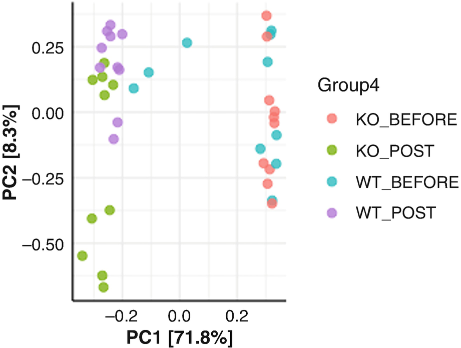
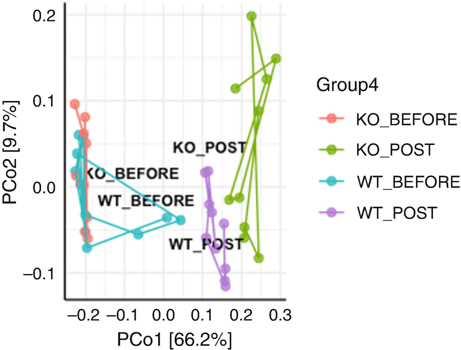
An ordination plot created through the principal component analysis for Q T R T 1 gene data measures K O before, K O post, W T before, and W T post represented by different colored dots with legends.
Ordination plot for QTRT1 data generated by PCA with sample points colored by the groups
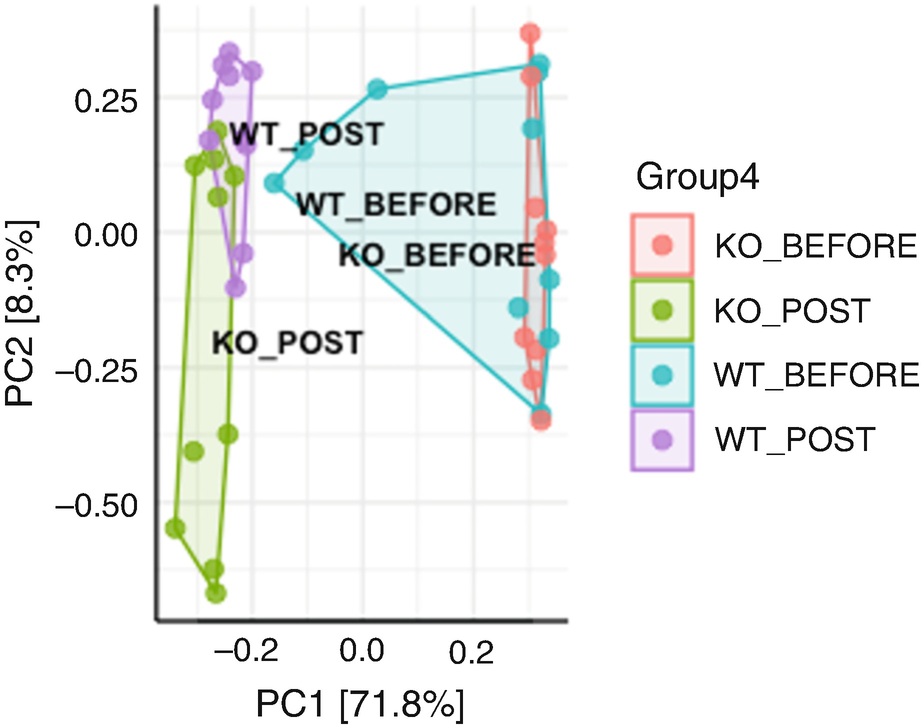
An ordination plot created through the principal component analysis for Q T R T 1 gene data measures K O before, K O post, W T before, and W T post represented by a grouping of values using line connectors with the neighboring values.
Ordination plot for QTRT1 data generated by PCA with the sample points colored and framed by the groups
10.3.4 Principal Coordinate Analysis (PCoA)
PCoA is a conceptual extension of PCA and advance in ordination technique. It is a metric (multidimensional) scaling method. Any Euclidean distance/similarity and non-Euclidean distance/similarity measures and their association coefficients can be used in PCoA. All types of variables (quantitative, semiquantitative, qualitative variables or even datasets with variables with mixed levels of precision) can be used. Thus, it is the most often used ordination technique in ecology and microbiome study.
10.3.4.1 Introduction to PCoA
PCoA or also known as metric multidimensional scaling (MMDS) (Richardson 1938) was developed by John Gower (1966). It uses spectral decomposition to approximate a matrix of distances/dissimilarities to reduce dimensions of data points (Gower 2005). In contrast to PCA, which typically tells us about the major relationships among a set of samples and how that relationship is determined by a set of variables, PCoA primarily tells us the similarity among the samples, and the individual data variables are less important. PCoA works by two steps: First, calculate the dissimilarity for every pair of samples in the high-dimensional space using a particular distance (dissimilarity) measure (e.g., Bray-Curtis dissimilarity) chosen by the user. Then, represent the samples in the reduced two dimensions such that their pairwise Euclidean distances approximate their corresponding distances in high-dimensional space as closely as possible.
Similar to PCA, RDA, CA, and CCA, PCoA is also based on eigen analysis, which suggests each resulting axis is an eigenvector associated with an eigenvalue, and all axes are orthogonal to each other. The unique information revealed by the axes are the inertia (in terms of ecology, variance) in the data and exactly how much inertia is indicated by the eigenvalue. The ordination result is plotted in an x/y scatterplot in this way: the largest eigenvalue is plotted on the first axis, and the second largest eigenvalue on the second axis. PCoA has these properties: The result of PCoA on distances obtained from standardized variables is identical with that obtained from PCA of product-moment correlation coefficients (J. C. Gower 1967). PCoA only approximates the solution of principal components when it is used to non-Euclidean distance.
- 1.
PCoA is flexible to be used any distances (need not be Euclidean), and hence any distance/dissimilarity measure can be explicitly chosen (Gower 1966), including any common measures: Manhattan distances, Minkowski metric distances (Sneath and Sokal 1973), Bray-Curtis dissimilarity, Pearson chi-squares, Jaccard, Chord, and phylogenetic distance (e.g., UniFrac distance).
- 2.
When PCoA is used in any Euclidean distance matrix, principal components can be computed without having either the original data matrix or a variance-covariance matrix of the variables or objects (samples) (Sneath and Sokal 1973) such as the matrices of characters by OTUs in numerical taxonomy, species by objects in ecology, or OTUs/species by samples in microbiome.
- 3.
In PCoA ordination plot can be performed on sets of OTUs for which either original data matrices are not available or when such matrices cannot be obtained because of the nature of the data (Sneath and Sokal 1973).
- 4.
PCoA appears to be less disturbed by missing values than PCA (Rohlf 1972).
10.3.4.2 Implement PCoA
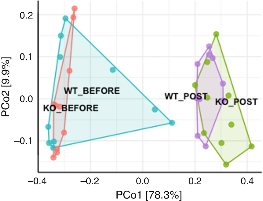
An ordination plot created through the principal coordinate analysis for Q T R T 1 gene data measures K O before, K O post, W T before, and W T post without Hellinger data transformation is represented by the grouping of values using line connectors with the neighboring values.
Ordination plot for QTRT1 data generated by PCoA without Hellinger data transformation
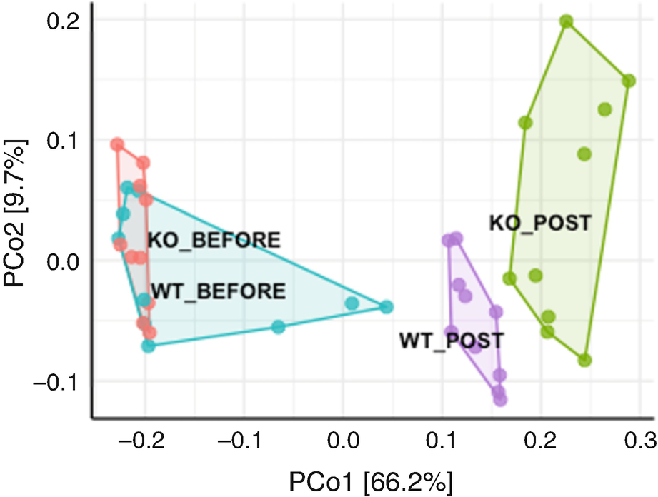
An ordination plot created through the principal coordinate analysis for Q T R T 1 gene data measures K O before, K O post, W T before, and W T post with Hellinger data transformation is represented by the grouping of values using line connectors with the neighboring values.
Ordination plot for QTRT1 data generated by PCoA with Hellinger data transformation
By using Hellinger data transformation (Fig. 10.4), we obtain nice ordination plot with two post groups being more differentiating each other. However, we get the following warning message:
An ordination plot created by the Bray-Curtis measure for Q T R T 1 gene data measures K O before, K O post, W T before, and W T post. The values are connected to each other through lines drawn between them.
Ordination plot for QTRT1 data generated by PCoA with Bray-Curtis measure and sample trajectory
10.3.5 Nonmetric Multidimensional Scaling (NMDS)
NMDS is the most general ordination technique. Like PCoA, any Euclidean distance/similarity and non-Euclidean distance/similarity measures and their association coefficients can be used in NMDS. Also similar to PCoA, all types of variables (quantitative, semiquantitative, qualitative variables, or even datasets with variables of mixed levels of precision) can be used. Thus, it is also most often used in ecology and microbiome study.
10.3.5.1 Introduction to NMDS
The intuitive ideas and general procedure of NMDS were provided by psychometrician Shepard (1962, 1966); however, the formal “goodness of fit” hypothesis testing procedure of NMDS was developed by mathematician, statistician, and psychometrician Kruskal (1964a, b; Mead 1992). NMDS was originally intended as a psychometric technique. In 1977, the utility of Kruskal’s (1964a, b) NMDS for community ecology was independently discovered and demonstrated by Prentice (1977) and Fasham (1977). NMDS represents n objects/samples geometrically by n points to obtain the interpoint distances corresponding to the experimental dissimilarities between objects samples. The fundamental hypothesis of NMDS is that dissimilarities and distances are monotonically related (Kruskal 1964a). The goal of NMDS is to find n points whose interpoint distances closely agree with the given dissimilarities between n objects/samples. An ordination (a reduced-space scaling) would be perfect if the rank order of the computed (fitted) distances were monotonically related to and were identical to the observed (original) ordinal distances/dissimilarity function (Sneath and Sokal 1973, p. 249). In other words, a reduced-space scaling would be perfect if all points in the Shepard diagram fell exactly on the regression line (straight line, smooth curve, or step function) and the value of the objective function would be zero (Legendre and Legendre 2012, p. 515).
In 1964, Kruskal (1964a) developed a measure of stress. In the same year, Kruskal (1964b) used an iterative technique to compute coordinates for the k-space, which aims to minimize the stress for any given Minkowski distance coefficient and for any dimensionality k.
Similar to PCoA, for the use of NMDS, we first need to calculate a matrix of sample dissimilarities using a chosen distance metric. However, in contrast to PCoA and also differencing from PCA, RDA, CA, and CCA (all these are eigen analysis-based methods using a direct eigen analysis algorithm), (1) NMDS instead is a rank-based method. It calculates the ranks of these distances among all samples and finds both a nonparametric and monotonic relationship between the dissimilarities and the Euclidean distances. Thus, NMDS focuses mainly on the ranking of dissimilarities rather than their numerical values (Xia 2020). (2) Different from the eigen analysis-based analyses, NMDS takes an iterative procedure to perform ordination and hence results in more than one single solution. (3) NMDS also uses a stress value rather than eigenvalues to determine the “success” of the ordination. The rule of thumb for stress value (goodness of fit) is as follows: greater than 0.20 is considered unacceptable (poor), 0.1 is acceptable (fair), 0.05 good, 0.025 excellent, and 0 “perfect.” Here “perfect” means only that there is a perfect monotone relationship between dissimilarities and the distances (Kruskal 1964a). Or generally stress value above 0.20 is unlikely to be of interest; above 0.15 must still be cautious; from 0.1 to 0.15 is better; from 0.05 to 0.1 is satisfactory; below 0.05 is impressive (Kruskal 1964b), although it has been reviewed that these guidelines are oversimplistic because such a stress tends to increase with increasing numbers of samples (Clarke 1993).
- 1.
NMDS has the great advantage that it can consider asymmetrical dissimilarity matrices (nonmetric distances or nonsymmetric matrices) as well as those with missing or tied dissimilarity values (Sneath and Sokal 1973, p. 250). Actually NMDS has the feature that the more distances being missed, the easier to be computed as long as there are enough (dissimilarities) measures observed left to position each object with respect to a few of the others. This feature makes NMDS to be an appealing method for the analysis of matrices where missing pairwise distances often occur (Legendre and Legendre 2012, p. 513).
- 2.
Similar to PCoA, NMDS is flexible to explicitly choose the distance measure from different measures including common measures: Bray-Curtis dissimilarity, Pearson chi-squares, Jaccard, Chord, as well as currently UniFrac distance which incorporates phylogeny.
- 3.
Specially compared to PCA, NMDS has advantage in giving balance between the large inter-cluster distances and the fine differences between members of a given cluster (Rohlf 1970) and can summarize distances in fewer dimensions (i.e., lower stress in two dimensions) (Gower 1966) although a solution of PCoA remains easier to compute in most cases.
In summary, the advantages of NMDS include its robustness, independency of any underlying environmental gradient, and ability of handling missing values and different types of data at the same time. However, same as PCoA, NMDS only can investigate differences between samples but cannot plot both species (taxa/OTUs) scores and sample scores through a biplot.
10.3.5.2 Implement NMDS
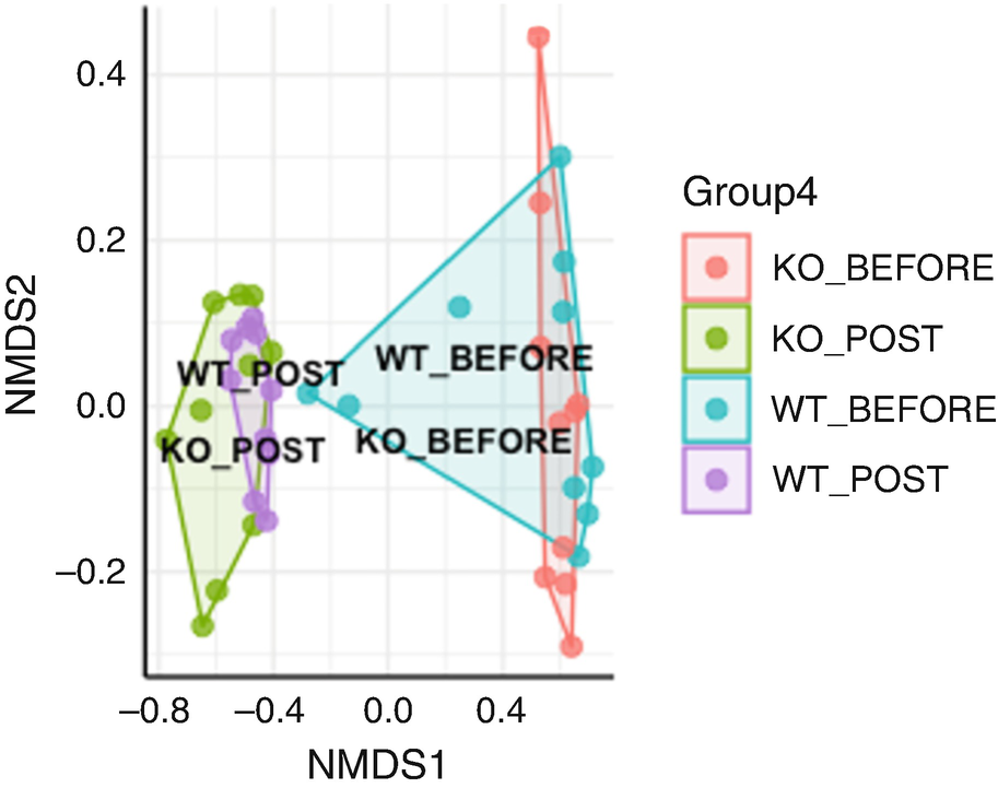
An ordination plot created by the Bray-Curtis measure with non-metric multidimensional scaling for Q T R T 1 gene data measures K O before, K O post, W T before, and W T post. The values are connected to each other through lines drawn between them. The W T before and K O before data increases along N M D S 1 value.
Ordination plot for QTRT1 data generated by NMDS with Bray-Curtis measure
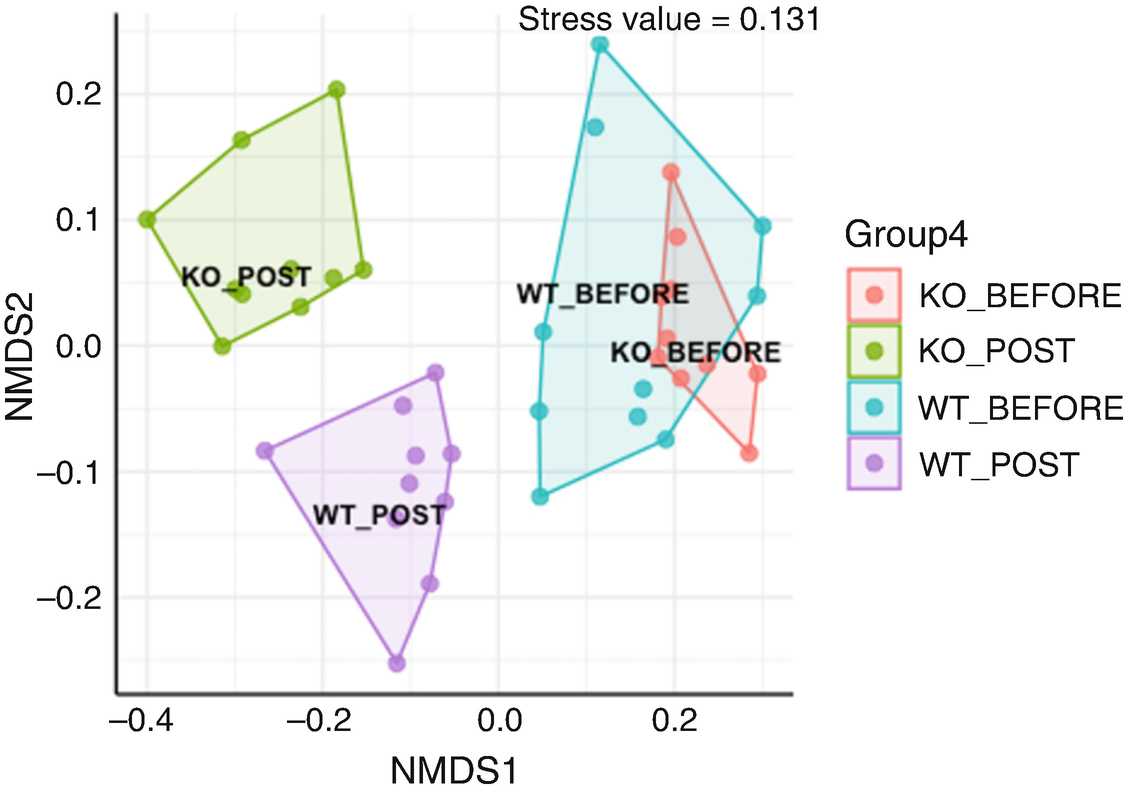
An ordination plot created by the Jaccard measure with non-metric multidimensional scaling for Q T R T 1 gene data measures K O before, K O post, W T before, and W T post. The values are grouped together by the lines drawn between them. The W T before and K O before data increases along N M D S 1 value.
Ordination plot for QTRT1 data generated by NMDS with Jaccard measure
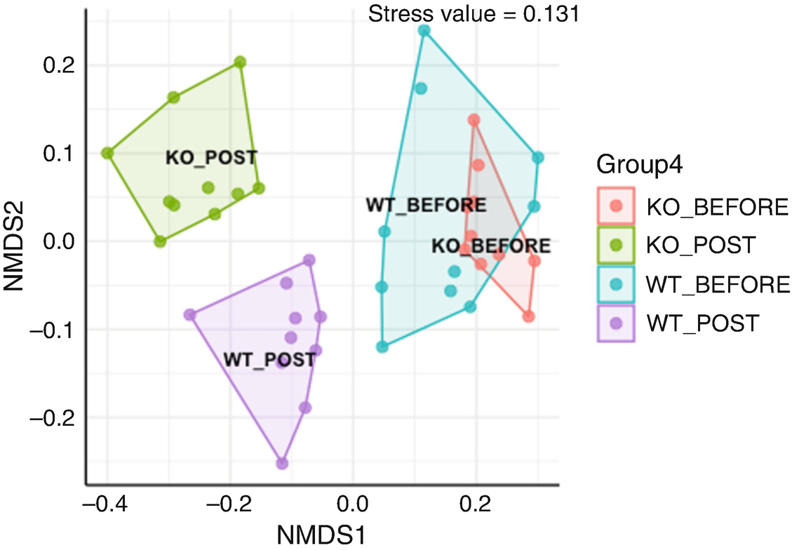
An ordination plot created by the Jaccard measure and Hellinger data transformation with non-metric multidimensional scaling for Q T R T 1 gene data measures K O before, K O post, W T before, and W T post. The values are grouped together by the lines drawn between them. The W T before and K O before data increases along N M D S 1 value.
Ordination plot for QTRT1 data generated by NMDS with Jaccard measure and Hellinger data transformation
10.3.6 Correspondence Analysis (CA)
CA uses χ2 distance measure. It requires nonnegative, dimensionally homogeneous quantitative or binary data; specifically species (taxa or OTUs) abundance or presence/absence data can be used in ecology and microbiome study. CA has been used in ecology and microbiome study.
10.3.6.1 Introduction to CA
CA was developed or defined independently over time by a number of ways and several authors in different areas. Thus, CA has been known under different names, such as contingency table analysis (Fisher 1940), RQ technique (Hatheway 1971), reciprocal averaging (Hill 1973), correspondence analysis (Hill 1974), reciprocal ordering (1975) (Orlóci 2013), dual scaling (Nishisato 1980), and homogeneity analysis (Meulman 1982).
At least three approaches have been categorized in the literature (Greenacre 1988): (1) the dual scaling approach (Nishisato 1980; Healy and Goldstein 1976), (2) the geometric approach (Benzécri 1973; Greenacre 1984; Lebart et al. 1984), and (3) the approach that is considered as a method of weighted least-squares lower-rank approximation of a data matrix. The dual scaling approach aims to assign scale values to the categories of a set of discrete variables in order to maximize the variance of the resultant case scores (Greenacre 1988). This is like the analogy to PCA in the style of Hotelling (1933). The geometric (graphical) approach in CA was largely due to Benzécri (1973). It takes three steps (Greenacre 1988; Borg and Groenen 2005): First it normalizes row and column profiles by dividing the rows and columns with their respective totals so that it sums to one in each row and column, respectively. Second, it maps the row and column profiles, to points in high-dimensional Euclidean spaces. Third, it finds the low-dimensional subspaces closest to these points. The final step is achieved by rotating to principal axes such that the first dimension accounts for the maximum variance, the second dimension maximizes the remaining variance, and so on (Borg and Groenen 2005). This is analogous to the geometric approach to PCA pioneered by Pearson (1901). In the context of a two-way contingency table, the approach of weighted least-squares lower-rank approximation of a data matrix provides a decomposition of the usual Pearson chi-squared statistic for testing independence of rows and columns (Greenacre 1988).
The above three approaches coincide in the correspondence analysis of a two-way contingency table. Although CA in principle can be used on any rectangular table with nonnegative similarity values, it is a technique particularly suited for analyzing a contingency table of two categorical variables. The role of the rows and columns can be reversed by simply transposing the correspondence table.
This technique was reviewed (1980) (Nishisato 1980, 1984) that can trace its origin back to 1933 (Richardson and Kuder 1933).
CA was proposed for the analysis of contingency tables by Herman Otto Hartley (Hirschfeld 1935) and Fisher (1940) and later developed by Jean-Paul Benzécri (1973) to connect correlation and contingency. Since the 1960s and 1970s, CA have been used to analyze the sites by species tables in ecology, including Hatheway (1971) and Hill (1973, 1974) among others. Correspondence analysis introduced by Guttman (1941), Torgerson (1958, p. 338), and Hill (1973) is a method of scaling rather than of contingency table analysis (Hill 1974). The technique described in 1974 by Hill (1974) under the name “correspondence analysis” (a name translated from French “l'analyse factorielle des correspondances”) (Benzécri 1973) is an analogue of PCA, which is appropriate to discrete rather than to continuous variates. Hill (1974) traced its first publication from Hirschfeld (1935). Since the name of correspondence analysis (CA) was introduced in 1973 by Hill to ecologists. CA quickly gained in popularity because of its better recovery of dimensional gradients than PCA and gradually replaced polar ordination and is used so far. Additionally, different from PCA, which is based on the linear relationship of taxa/species, CA assumes modal relationships of taxa relative to ecological gradients. Thus, this method is more attractive than PCA on the theoretical grounds.
Several important standard textbooks on correspondence analysis have been published including Nishisato (1980); Greenacre (1984); Lebart et al. (1984); ter Braak (1988a); van Rijckevorsel and de Leeuw (1988); and Gifi (1990). CA has been applied to microbiome data (Xia et al. 2018b).
CA is an eigen analysis-based method. The goal of CA is to find correspondence (interaction) between rows and columns of a contingency table (or to show the interaction of two variables in this table graphically) and to represent the correspondence in an ordination space. CA is a residual-based analysis. It analyzes residuals to capture the discrepancy between observed counts and the counts expected in the identical taxa composition over all samples. Thus, a certain mean-variance relationship for normalization of these residuals is implicitly assumed in CA.
CA conceptually is similar to PCA. CA can be considered as an equivalent of PCA on a contingency table of two categorical variables, in which every entry value provides the frequency of each combination of categories of the two variables. However, CA is based on the Pearson chi-squared measure and hence is used to analyze nominal or categorical data instead of continuous data. The three important differences between CA and PCA methods are as follows: (1) PCA maximizes the explained variance of measured variables, whereas CA maximizes the correspondence (similarity of frequencies) between rows (measured variables) and columns (samples) of a table (Yelland 2010); (2) PCA assumes a linear relationship among variables, whereas CA expects a unimodal model (Paliy and Shankar 2016); (3) CA uses weighted Euclidean distance (or reciprocal averaging, a variant of Euclidean distance) or chi-square distance to estimate the distances among samples in full CA ordination space.
CA and MDS (multidimensional scaling) also share several common properties and differ on other aspects. Borg and Groenen (2005) have provided an excellent comparison of CA and MDS techniques. We summarize the main points here. CA and MDS graphically display the objects (samples) as points in a low-dimensional space. However, several differences exist between them: (1) Basically, MDS is a one-mode technique and thus only analyzes one set of objects (samples), whereas CA is a two-mode technique and thus it displays both row and column objects (samples) as in unfolding (Borg and Groenen 2005). (2) MDS can use all types of data variables including quantitative/frequencies, qualitative/rankings, correlations, ratings, or nonnegative or negative, even mixed datasets, whereas CA restricts the data to be nonnegative. (3) MDS can accept any dissimilarity or similarity measures, whereas CA uses the χ2 distance as a dissimilarity measure. (4) In MDS, the distances between all points can be directly interpreted, whereas in CA the relation between row and column points can only be assessed by projection and their points only can be interpreted, respectively. Therefore, we should interpret the results from CA with some care, similar to non-Euclidean MDS solutions (Borg and Groenen 2005).
In summary, unlike PCA, CA (and its constrained version CCA) is very sensitive to the less abundant and often unique species (or taxa/OTUs) in the samples. Thus, CA is a powerful method to investigate which species (or taxa/OTUs) characterizes each sample or group of samples. However, CA suffers from two major problems: (1) It is vulnerable to produce a noticeable mathematical artifact called “arch effect” (ter Braak and Šmilauer 2015; Gauch 1977) sometimes also known as the “horseshoe effect” (Kendall 1971), which is caused by the unimodal species response curves. (2) It suffers from compression of the ends of the gradient. Unimodal distribution refers to a distribution with one mode. In the unimodal species response curves, the expected abundance of species/taxon has a bell-shaped functional relationship with a score with one optimal environmental condition (see Section 6.3.4 of Xia and Sun 2022a). Thus, the species will have a lesser abundance and hence have poor performance if any environment condition is greater or lesser than this optimum. (3) As a residual-based approach, CA is not well suitable to skewed data, and its mean-variance assumption is too rigid to account for the overdispersion (Warton et al. 2012).
10.3.6.2 Implement CA
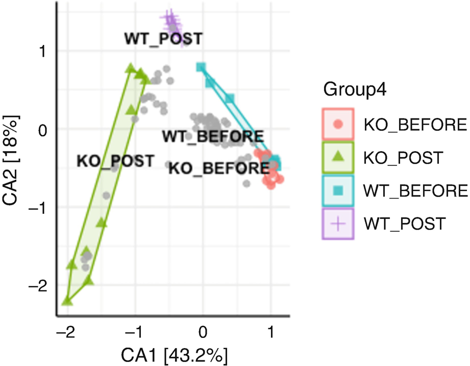
An ordination plot created by the correspondence analysis for Q T R T 1 gene data measures K O before, K O post, W T before, and W T post. The values are grouped together by the lines drawn between them. The W T before and K O before data increases along N M D S 1 value.
Ordination plot for QTRT1 data generated by CA
The ordination plot generated with CA (Fig. 10.9) is different from that obtained with PCA (Fig. 10.1). Their species scores are also shown having big differences as seen in the biplot below.
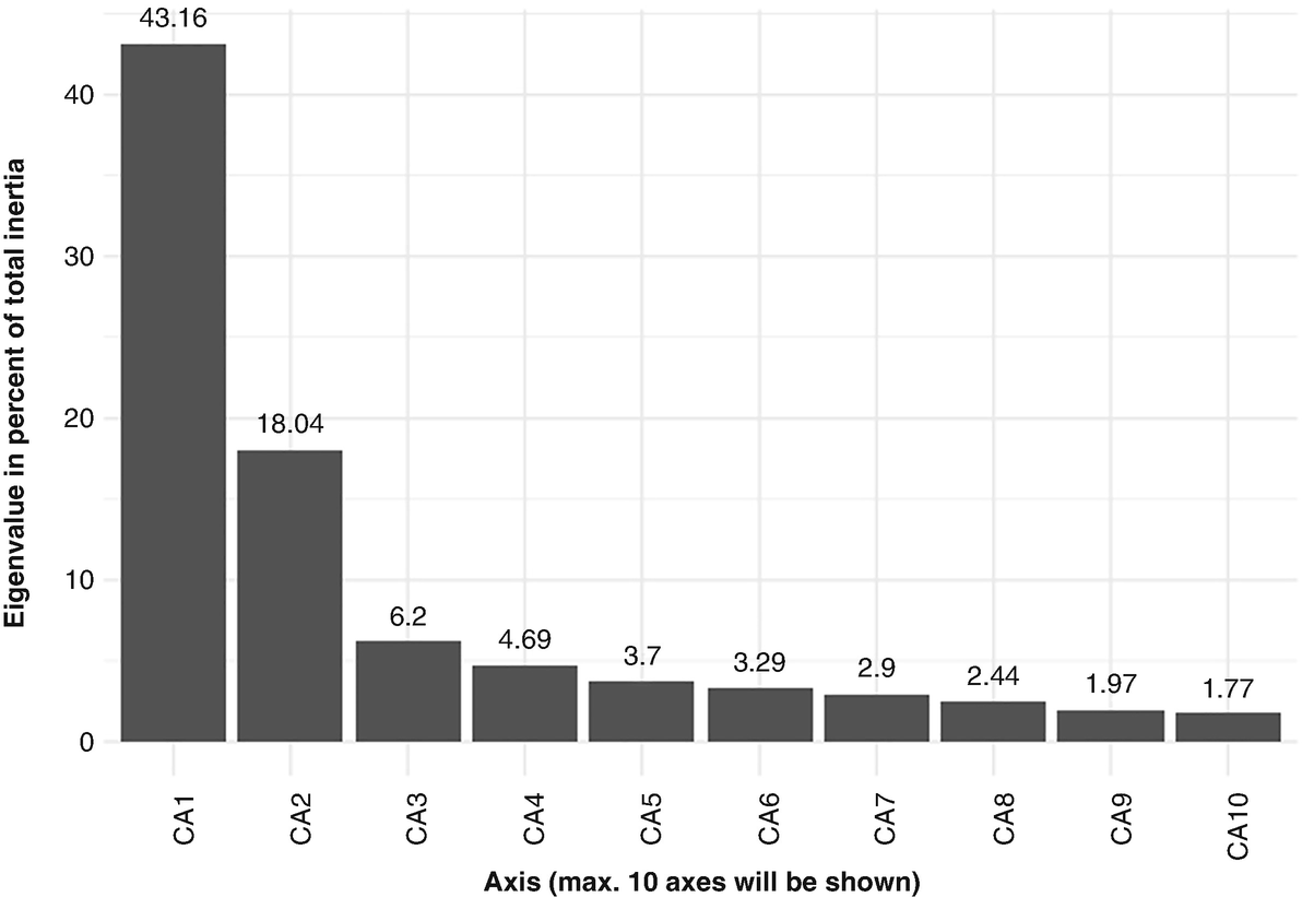
A bar chart measures the Eigenvalue percentage of 10 significant axes from C A 1 to C A 10 with respect to the Q T R T 1 data. The axes have values of 43.16, 18.04, 6.2, 4.9, 3.7, 3.29, 2.44, 1.97, and 1.77.
Scree plot is used to obtain an overview of each axis’ contribution to the total inertia and confirm those most significant axes based on QTRT1 data
Scree plot is a simple bar plot that plots all the axes and their eigenvalues. We can use it to get an overview of each axis’ contribution to the total inertia and confirm those most significant axes. In the following bar plot, we can see CA1 explains 43.16% of total variability, which is equal to 0.2420/0.561 = 0.4314 in above model. Similarly, CA2 explains 18.04% of total variability, which is equal to 0.1012/0.561 = 0.1804.
10.3.7 Detrended Correspondence Analysis (DCA)
In Sect. 10.3.6.1, we described that CA suffers from two major problems: the arch effect and the edge effect (compression of the ends of the gradient). The first problem results in consequence that the second CA axis cannot easily be interpreted due to an artifact, while the second problem causes the position of objects/samples (and taxa/species) along the first axis to be not necessarily related to the amount of change (or beta diversity) along the primary gradient. That is, CA particularly has two inherent distortions: (1) one-dimensional gradients tend to be distorted into an arch on the second ordination axis, and (2) samples tend to be unevenly spaced along the axis 1.
10.3.7.1 Introduction to DCA
Fortunately in 1979, Hill (1979) corrected some of the drawbacks/distortions of CA and thereby created improved ordination technique called detrended correspondence analysis (Hill and Gauch 1980). It remedies both the edge effect and the arch effect, which has been the most widely used indirect gradient analysis today. To overcome these problems, DCA flattens this arch and rescales the positions of samples along an axis. DCA aims to find the main factors or gradients in large, species-rich but usually sparse data matrices. Thus, DCA is frequently used to suppress these two artifacts inherent in most other multivariate analyses when applied to gradient data (Hill and Gauch 1980).
The software DECORANA (Detrended Correspondence Analysis) was developed to implement detrended correspondence analysis, which has become the backbone of many later software packages including vegan.
Step 1: Start by running a standard ordination to calculate correspondence analysis/reciprocal averaging with either eigen analysis approach or reciprocal averaging (RA) approach (more intuitive) on the data.
Given a matrix of n rows of samples and p columns of taxa, RA initially assigns an arbitrarily chosen score to each sample. Then, it calculates scores for each taxon as a weighted average by multiplying the abundance of a taxon by the sample score and sums them across all samples and divides by the total abundance for that taxon. Next, it uses these taxon scores to calculate a new set of sample scores via the same procedure for each sample. Finally, it centers and standardizes the calculated sample scores. Alternately repeat the procedure of calculating sample and taxon scores until the scores are stabilized. For details on the algorithm of the “reciprocal averaging” technique, the readers are referred to Hill (1973) and ter Braak (1987c).
Step 2: Detrend axes to effectively squash the curve flat. Several methods are available for detrending an axis. The simplest way is to divide the first axis into an arbitrary number of equal-length segments (default = 26, which has empirically produced acceptable results); within each segment, re-center the scores on the second axis to have mean value of zero. By implementing detrending, arch will be flattened onto the lower-order axis if there is arch present.
Step 3: Remove the edge effect by nonlinear rescaling of the axis. Before rescaling the species, curves are narrower near the ends of the axis than in the middle because of the edge effect. Thus, to remove the edge effect, it needs to rescale the axis to ensure that the ends are no longer compressed relative to the middle. The methods proposed to rescale include using polynomial regressions and using a sliding moving average window, which is the algorithm R used. The rescaling of an axis results in equalizing the weighted variance of taxon scores along the axis segments, such that 1 DCA unit approximates to the same rate of turnover all the way through the data.
- 1.
- 2.
DCA was evaluated giving a much closer approximation to ML Gaussian ordination than CA did based on a two-dimensional species packing model using simulated data (ter Braak 1985b), in which this improvement was shown mainly due to the detrending, not to the nonlinear rescaling of axes.
- 3.DCA performed substantially better than CA when the two major gradients differed in length (Kenkel and Orlóci 1986). However, DCA also has several disadvantages, including:
- (a)
DCA sometimes “collapsed and distorted” CA results when (a) there were few species per site and (b) the gradients were long (Kenkel and Orlóci 1986), in which few species per site were believed to be the real cause of the collapse (ter Braak 1987c).
- (b)
DCA may flatten out some of the variation associated with one of the underlying gradients because an instability in the detrending-by-segments method causes this loss of information (Minchin 1987).
- (c)
DCA has been thought being “overzealous” in correcting the “defects” in CA and “may sometimes lead to the unwitting destruction of ecologically meaningful information” (Pielou 1984, p. 197), mainly for the somewhat arbitrary and “overzealous” nature of its detrending process, but also because of the sometimes inappropriate imposition and non-robust behavior of an underlying χ2 distance measure (Pielou 1984; Faith et al. 1987; Gower 1992; Clarke 1993).
DCA overall is a popular and reasonably robust approximation to Gaussian ordination method. DCA eliminates the arch effect that CA is suffered and is much more practical. However, to increase its robustness, two modifications are needed: First, since the edge effect is not too serious, the routine use of nonlinear rescaling was not advised (ter Braak and Prentice 1988). Second, the arch effect needs to be removed (Heiser 1987; ter Braak 1987c), but a more stable, less “zealous” method of detrending, namely, detrending by polynomials, was recommended (Hill and Gauch 1980; ter Braak and Prentice 1988).
Because some forms of nonmetric multidimensional scaling may be more robust (Kenkel and Orlóci 1986; Minchin 1987), some ecologists have suggested using MDS method although whether DCA or MDS can produce stronger distortions is not consistently confirmed. Here, we illustrate DCA using the same data used in Example 10.1.
10.3.7.2 Implement DCA
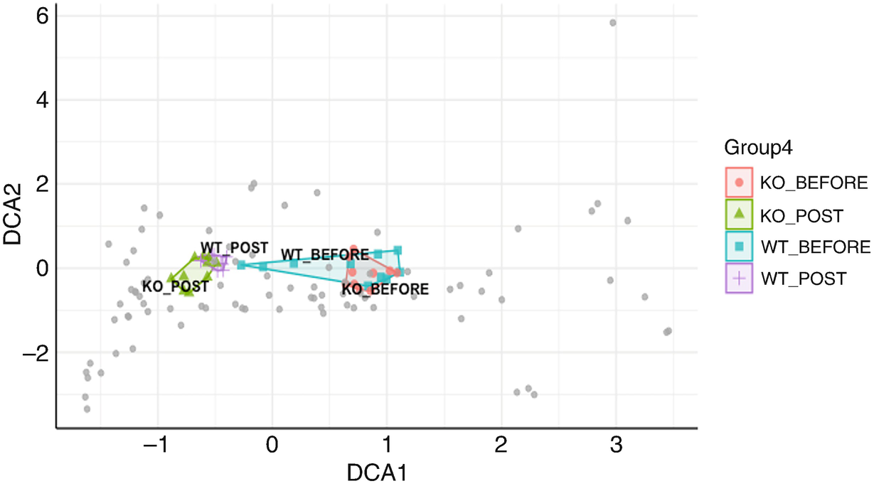
An ordination plot created by the detrended correspondence analysis for Q T R T 1 gene data measures K O before, K O post, W T before, and W T post. The values are grouped together by the lines drawn between them. The W T before and K O before data increase along the D C A 1 value.
Ordination plot for QTRT1 data generated by DCA
10.3.8 Redundancy Analysis (RDA)
Canonical analysis simultaneously analyzes two or eventually more data tables. Canonical analysis allows us to perform either direct comparison (direct gradient analysis) or indirect comparison (indirect gradient analysis) of two data matrices such as species/taxa composition table and environmental/metadata variables table. In direct comparison analysis, the matrix of explanatory variables X intervenes in the calculation producing the ordination of response matrix Y, forcing the ordination vectors to be maximally related to combinations of the variables in X. In contrast, in indirect comparison, matrix X does not intervene in the calculation. Correlation or regression of the ordination vectors on X is computed a posteriori (Legendre and Legendre 2012).
10.3.8.1 Introduction to RDA
RDA method was first proposed by Rao (1964) and was later rediscovered by Wollenberg (Van Den Wollenberg 1977). RDA belongs to canonical analysis. In RDA, each canonical ordination axis corresponds to a direction, in the multivariate scatter of objects/samples (matrix Y), which is maximally related to a linear combination of the explanatory variables X (Legendre and Legendre 2012). RDA assumes that variables from two datasets (e.g., an environmental dataset and a taxa abundance dataset) are asymmetrical and play different roles: ones are the “independent variables,” and the others are the “dependent variables.”
RDA can be understood in terms of two extensions: (1) It directly extends multiple regression to model multivariate response data. RDA is an asymmetric analysis of the response variables (Y matrix/table) and the explanatory variables (X table). (2) It also extends PCA because the canonical ordination vectors are linear combinations of the response variables Y. However, RDA differs from PCA on the factor that these ordination vectors in RDA not only could be computed on the matrix Y but also are constrained to be linear combinations of the variables in X. Thus, RDA is a constrained version of PCA.
Same as its unconstrained version PCA, RDA (PCA with instrumental variables) uses the Euclidean distance measure based on the Pythagorean theorem (Rao 1964). As constrained ordination, RDA was developed to assess how much variation in one set of variables can be explained by the variation in another set of variables. As a multivariate extension of simple linear regression into sets of variables, RDA summarizes the linear relations between multiple dependent and independent variables in a matrix, which is then incorporated into PCA (Rao 1964).
PCA and RDA ordination techniques have a better performance when species have monotonic distributions along the gradients. However, they both assume that the principal components (PCs) are constrained to be linear combinations of the explanatory variables. Thus, like PCA, RDA is inappropriate when relationship between response and environmental variables is unimodal rather than linear (Xia 2020, p. 383). Additionally, RDA usually does not completely explain the variation in the response variables (matrix Y) (Legendre and Legendre 2012, p. 641).
10.3.8.2 Implement RDA
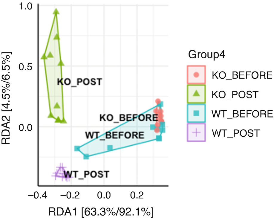
An ordination plot created by the redundancy analysis for Q T R T 1 gene data measures K O before, K O post, W T before, and W T post. The values are grouped together by the lines drawn between them.
Ordination plot for QTRT1 data generated by RDA
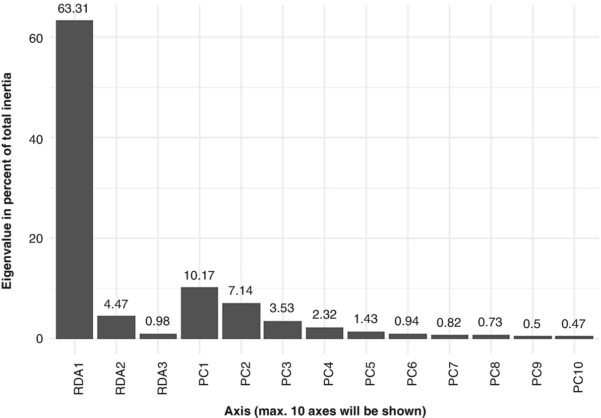
A bar chart measures the Eigenvalue percentage of 10 significant axes from R D A 1 to R D A 10 with respect to the Q T R T 1 data. The axes have values of 63.31, 4.47, 0.98, 10.17, 7.14, 3.53, 2.32, 1.43, 0.94, 0.82, 0.73, 0.5, and 0.47.
Scree plot generated by RDA based on QTRT1 data
We print partial output as below. We can see the constrained axes explain 68.76% of total variances, while the unconstrained axes explain 31.24% of total variances. RDA1 can explain 63.31% (0.1527/0.2412) of total variances. Thus, the most variation of the data can be explained by the groups:
10.3.9 Canonical Correspondence Analysis (CCA)
CCA is the canonical form of CA. In CCA, any data table can be used for correspondence analysis to form a suitable response matrix Y for CCA: particularly, species/taxa presence-absence or abundance tables.
10.3.9.1 Introduction to CCA
CCA canonical asymmetric ordination method was developed by ter Braak (1986, 1987a, b). It was first implemented in the program CANOCO (ter Braak 1988a, b, 1990; ter Braak and Šmilauer 1998, 2011) and now is available in several R packages and functions including the ecological R package vegan and microbiome package ampvis2, which we use to illustrate CCA below.
CCA (ter Braak 1986) ushered in the biggest modern revolution in ordination methods. Previously ordination was mainly an “exploratory” method (Gauch, Jr. 1982a, b), CCA technique coupled CA with regression methodologies, and hence it provides for hypothesis testing. Thus, ordination has been considered not mere “exploratory” analysis but also a hypothesis testing when canonical correspondence analysis (CCA) was introduced (ter Braak 1985a). CCA has been getting popular in community ecology since its introduction in 1986 (Wilmes and Bond 2004) and adopted to analyze microbiome data by microbiome researchers.
As a classical exploratory analysis method of contingency tables, CA (Benzécri 1973) is an unconstrained ordination technique, allowing for quantification of taxon contributions to the sample ordination, while CCA is a constrained analysis, in which the response variable set is constrained by the set of explanatory variables (ter Braak 1986), even allowing restricting the sample ordination to be explained by sample-specific variables.
Like CA, CCA is based on the Pearson chi-squared measure. Similar to RDA, CCA aims to find the relationship between two sets of variables. However, different from RDA which constructs a linear relationship among variables, CCA assumes a unimodal relationship and measures the separation based on the eigen values produced by CCA (Ram et al. 2005). In microbiome studies, we can use CCA to investigate taxa-environment relations, answering the specific questions about the response of taxa to environmental variables.
To distinguish CCA and CA from RDA and PCA, we can informally consider CCA and CA as more qualitative methods, while RDA and PCA as more quantitative methods. Thus, they are generally suitable to analyze different types of data: CCA, CA, and DCA are more suitable for analyzing the data with a unimodal distribution of the species (taxa/OTUs) abundances along the environmental gradient, while RDA and PCA are appropriate to the data showing a linear distribution.
- 1.
Like DCA as a nonlinear ordination method, CCA is appropriate when the community variation is over a wider range (ter Braak and Prentice 1988), which is contrast to the linear ordination methods (PCA and RDA), which are appropriate when the community variation is within a narrow range. CCA and CA are chi-squared measure-based methods; theoretically they are more able to be used for ecological and microbiome data because these data are often sparse with many zeros with the fact that some species (taxa/OTUs) are present in some samples while absent in others.
- 2.
CCA is the most powerful and is a much more practical technique in detecting relationships between species composition and environment and like other constrained methods particularly given the number of environmental variables is smaller than the number of sites (objects/samples) (ter Braak and Prentice 1988). Like its unconstrained version CA, CCA is very sensitive to the lower abundant and unique species (or taxa/OTUs) in the samples and is a powerful method to investigate which species (or taxa/OTUs) characterize each sample or group of samples.
- 3.
CCA was evaluated as appropriate when it is used to describe how species/taxa respond to particular sets of observed environmental variables (McCune 1997).
- 1.
Like CA, CCA strongly assumes that species/taxa have unimodal response functions with respect to linear combinations of the environmental variables (ter Braak and Prentice 1988); that is, for each species/taxon, CCA expects its abundance shows a bell-shaped functional relationship with a particular sample along a gradient of environmental conditions (ter Braak 1986; Zhu et al. 2005).
- 2.
As a residual-based method, CCA implicitly assumes a certain mean-variance relationship for normalized residuals. Such a stringent mean-variance assumption is too rigid to account for skewed data and the overdispersion of sequencing data such as microbiome data (Warton et al. 2012).
- 3.
CCA can distort the representation of gradients in community structure when including noisy or irrelevant explanatory variables in the analysis and may mislead to misleading interpretations (McCune 1997).
10.3.9.2 Implement CCA
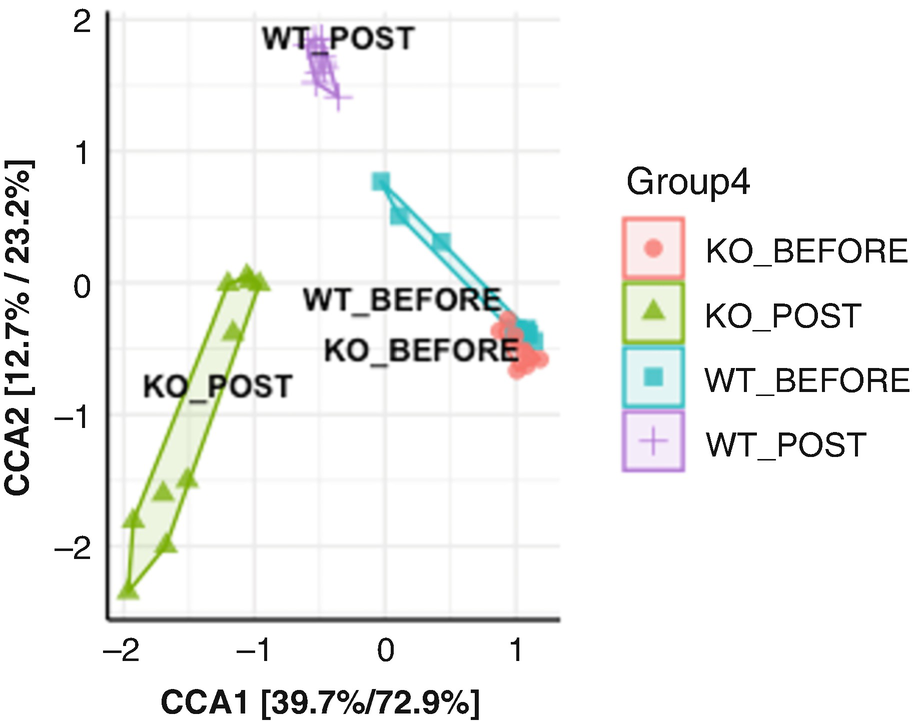
An ordination plot created by the canonical correspondence analysis for Q T R T 1 gene data measures K O before, K O post, W T before, and W T post. The values are grouped together by the lines drawn between them.
Ordination plot for QTRT1 data generated by canonical correspondence analysis (CCA)
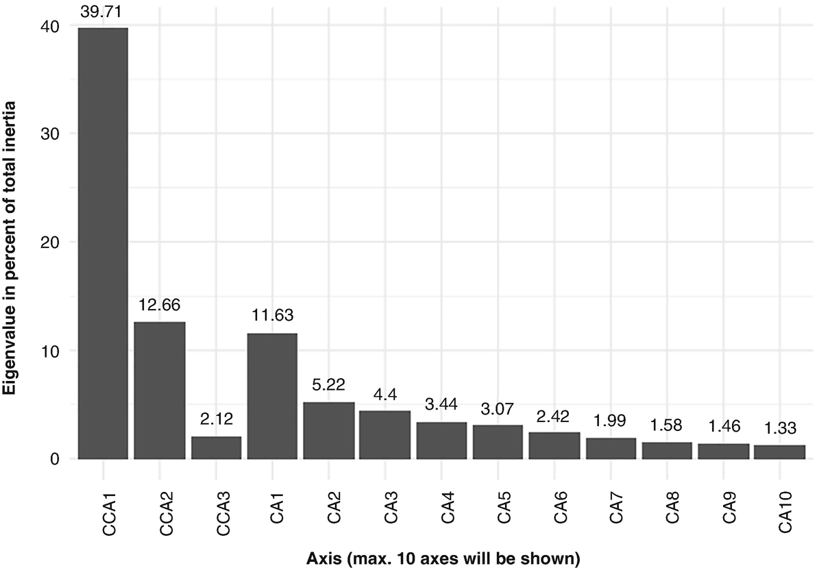
A bar chart measures the Eigenvalue percentage of 10 significant axes from C C A 1 to C C A 10 with respect to the Q T R T 1 data. The axes have values of 39.71, 12.66, 2.12, 11.63, 5.22, 4.4, 3.44, 3.07, 2.42, 1.99, 1.58, 1.46, and 1.33.
Scree plot generated by canonical correspondence analysis (CCA) based on QTRT1 data
The partial output is printed as below. We can see the constrained axes explain 54.5% of total variances, while the unconstrained axes explain 45.5% of total variances. CCA1 and CCA2 can explain 39.71% (0.2227/0.561) and 12.66% (0.0710/0.561) of total variances, respectively. Thus, the most variation of the data can be explained by the groups:
10.4 Beta Diversity Metrics and Ordination in QIIME 2
As we described in Chap. 9, in QIIME 2, diversity analyses are available through the q2-diversity plugin. The analyses include calculating alpha and beta diversity, statistical testing group differences, and generating interactive visualizations. In this section, we illustrate calculations of beta diversity measures and ordination techniques in QIIME 2. In Chap. 11, we will illustrate how to perform statistical testing of beta diversity in QIIME 2 (Sect. 11.7).
10.4.1 Calculate Beta Diversity Measures
In Chap. 9 (Sect. 9.5.1), we generated all the alpha diversity and beta diversity measures available in QIIME 2 using a single-command qiime diversity core-metrics-phylogenetic. The calculated beta diversity measures include weighted/unweighted UniFrac, Bray-Curtis, and Jaccard. Here, we repeat this single command as below for recall:
bray_curtis_distance_matrix.qza
jaccard_distance_matrix.qza
unweighted_unifrac_distance_matrix.qza,
weighted_unifrac_distance_matrix.qza
bray_curtis_pcoa_results.qza
jaccard_pcoa_results.qza
unweighted_unifrac_pcoa_results.qza
weighted_unifrac_pcoa_results.qza
bray_curtis_emperor.qzv
jaccard_emperor.qzv
unweighted_unifrac_emperor.qzv
weighted_unifrac_emperor.qzv
10.4.2 Explore Principal Coordinates (PCoA) Using Emperor Plots
A scatter plot has values for mouse gut microbiome principal coordinate analysis using Bray-Curtis distance measuring early time and late time, represented as red and blue color dots.
A two-dimensional principal coordinate analysis ordination of the mouse gut microbiome samples based on Bray-Curtis distance. Red color labels early time and blue labels late time
As recall, the core-metrics-phylogenetic command has already generated some emperor plots. When performing the qiime emperor plot command, we can specify an optional parameter --p-custom-axes to explore time-series data (in this case, DPW: days post weaning).
The qiime emperor plot command will use the PCoA results generated in core-metrics-phylogeny command. The PCoA results generated by the qiime emperor plot command will contain Axe 1 for principal coordinate 1 and Axe 2 for principal coordinate 2, respectively, and a third Axe (DPW: overlapped with Axe 2) for days post weaning. The third axis is used to explore how these samples changed over time.
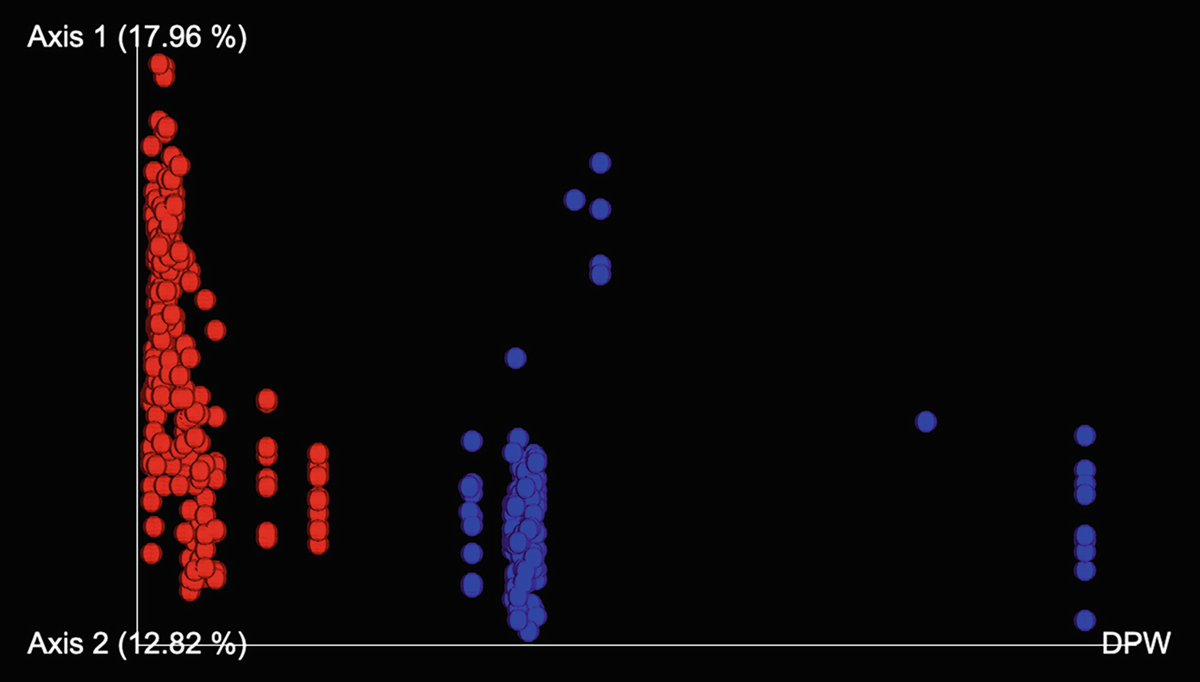
An Emperor plot has values for mouse gut microbiome principal coordinate analysis using Bray-Curtis distance measuring early time and late time, represented as red and blue color dots.
Emperor plots for Bray-Curtis distance in mouse gut microbiome samples

A single-line of text highlights the saving of a file as Bray Cutis Emperor D P W dot q z v.
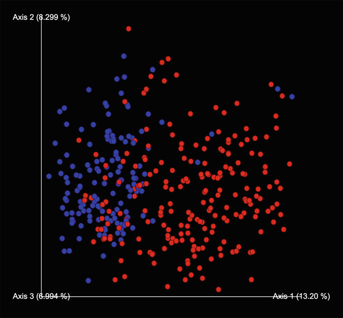
An Emperor plot has values for mouse gut microbiome principal coordinate analysis using unweighted UniFrac distance measuring early time and late time, represented as red and blue color dots.
Emperor plots for unweighted UniFrac distance in mouse gut microbiome samples

A single line of text highlights the saving of a file as unweighted UniFrac Emperor D P W dot q z v.
10.5 Remarks on Ordination and Clustering
Both clustering and ordination are often used in multivariate analysis. They are important components of a strategy for analyzing community data on community structure (multispecies distribution patterns) (Field et al. 1982; Clarke 1993). Clustering most commonly represents the results by a dendrogram/phenogram, which is useful for summarizing the taxonomic relationships, particularly when the OTUs are well clustered and fit readily into a hierarchy (Sneath and Sokal 1973, p. 303), while ordination produces summaries of the variation in A-space that differ greatly in appearance and may differ in the taxonomic results to which they lead. Thus ordinations are especially valuable for understanding the taxonomic structure in more detail, which are preferably in three dimensions or as several two-dimensional diagrams (Sneath and Sokal 1973, p. 303).
Sneath and Sokal (1973) and Legendre and Legendre (1998, 2012) among others have provided an excellent review on the general performances of clustering and ordination methods in the numerical taxonomy and numerical ecology literatures. Since the materials have not been largely available in current microbiome literature, we summarize their main points as follows. Overall, both clustering and ordination methods have their own advantages and disadvantages, and no methods have satisfactorily used the similarity matrix itself to tell us whether clustering or ordination is most appropriate.
The merits of many clustering methods have been discussed at length in Section 5.4 “A Taxonomy of Clustering Methods” and Section 5.5 “Sequential Agglomerative, Hierarchic, Nonoverlapping Clustering Methods” (Sneath and Sokal 1973, pp. 201–245). For example, a cophenetic correlation may suggest that a phenogram is a reasonable representation of well-clustered phenetic distributions (Sneath and Sokal 1973), and dendrograms have the advantage of simplicity (Field et al. 1982). However, cluster methods have the disadvantages, such as the following: (1) They will yield clusters of some kind, whatever the structure of the data, even if the OTU distributions are random (Sneath and Sokal 1973). (2) It was shown that phenograms give poor representations of relationships between major clusters (Rohlf 1967, 1970). (3) The flexible sorting method does not very well cluster much material and express a preference for accentuating clustering (Williams and Lance 1968). In particular, dendrograms have been reviewed suffering four main disadvantages (Field et al. 1982): (1) The hierarchy is irreversible – once a sample has been placed in a group, its identity is lost. (2) Dendrograms only show inter-group relationships, in which the level of similarity indicated is the average inter-group value. (3) The sequence of samples (objects/individuals) in a dendrogram is arbitrary, and two adjacent samples are not necessarily the most similar. And (4) dendrograms tend to overemphasize discontinuities and may force a graded series into discrete classes.
The advantages and disadvantages of individual ordination methods have been discussed at length in Sects. 10.3.3 for PCA, 10.3.4 for PCoA, 10.3.5 for NMDS, 10.3.6 for CA, 10.3.7 for DCA, 10.3.8 for RDA, and 10.3.9 for CCA. Here, we summarize some general discussions and main points about the disadvantages of ordination methods.
First, regarding what axes in an ordination are taxonomically meaningful is debatable in the numerical taxonomy literature. The first vector of a principal coordinate analysis was either omitted (Sheals 1965) or was thought as taxonomically meaningful (Sims 1966). Others thought that the first vector (Schnell 1970) or the fourth vector might represent a general size factor or reflected size (Seki 1969). Thus, there is no reason why the major axes of taxonomic variation should necessarily lie parallel to the direction that represents size (Sneath and Sokal 1973).
Second, the general disadvantages of ordination methods have been discussed, including the following: (1) Ordination may give no simple low-dimensional result with many OTUs and clusters (Williams and Lance 1968). (2) Clusters might have overlapped in two or three spaces although they are quite distinct in hyperspace. (3) Ordination may also be impracticable for very large numbers of characters (variables) and OTUs. (4) In particular, it was shown that like most clustering methods, Gower’s principal coordinates ordination method revealed the major structure of community data, but the finer divisions (known to be ecologically significant) were less evident in ordinations than in clustering (Webb et al. 1967). This finding is in line with the observation that distances between close neighbors are not well represented by PCA ordination (Rohlf 1968).
Because both clustering and ordination methods have their own advantages and disadvantages, to leverage and to take advantage of the characteristics of clustering and ordination methods, combining the results from these two types of analyses on the same diagram using the same similarity/dissimilarity (or distance) matrix has been independently proposed in the numerical taxonomy and numerical ecology (Gower and Ross 1969; Rohlf 1970; Schnell 1970; Jackson and Crovello 1971; Sneath and Sokal 1973; Legendre 1976; Field et al. 1982; Clarke 1993; Legendre and Legendre 2012).
Whether sequentially performing ordination and clustering is also debatable without determinate conclusions (Sneath and Sokal 1973). On the one hand, first performing an ordination and then clustering on the reduced space is generally desirable, but information of largely unknown nature and quality has been lost during the ordination, and very low-order dimensionality cannot express much of the multidimensional phenetic relationships. Actually, it was reviewed (Sneath and Sokal 1973) that clustering on the reduced space by an ordination does not necessarily improve clustering: the analysis results are either very similar or identical to the full-dimensional space and even appear less satisfactory. On the other hand, it was shown (Hill et al. 1965) that clustering on the reduced dimensions is satisfactory, which provides good reasons for first clustering taxonomic groupings from the full A-space and then using ordinations for investigating the general pattern of variation (Sneath and Sokal 1973).
In numerical taxonomy literature, both clustering and ordination have been recommended either preferring to cluster first and then make an ordination (Williams and Lance 1968) or preferring ordination methods first or no specific sequencing order. In general, PCA and PCoA are recommended, while NMDS method may be preferred particularly when there are scale problems because it often gives results very comparable to PCA (Sneath and Sokal 1973, p. 305).
In ecological literature, classification (clustering) and ordination have been used and recommended as two sequential stages for analyzing community data on community structure or multispecies distribution patterns (Field et al. 1982). Clustering and ordination are commentary to each other. Thus, it can unambiguously confirm the inadequacy of a two-dimensional description if they display inconsistent results (Clarke 1993). In general, principal component analysis (PCA), principal coordinate analysis (PCoA), nonmetric multidimensional scaling (NMDS), and correspondence analysis (CA) are most often used for ordination of species in ecology. For example, under the title “Ordination in reduced space,” PCA, PCoA, NMDS, and CA are introduced in various versions of Legendre and Legendre’s numerical ecology (Legendre and Legendre 2012). The metric multidimensional scaling (MDS) ordination techniques (essentially PCoA) and in particular nonmetric MDS, which is much more flexible, have been recommended for implementing ordination (Field et al. 1982).
A cutoff value for ordination to be a satisfactory representation of taxonomic structure was evaluated as follows (Sneath and Sokal 1973, p. 304): (1) if the cophenetic correlation coefficient (or other suitable criterion) between the ordination and the original similarity matrix is ≥0.8, then it is high and desirable; (2) if the reduced dimensions displayed accounted for ≥40% proportion of the variation, then the ordination may or may not be appreciable; and (3) if an ordination accounts for less than 40% proportion of the variation, then this ordination is unsatisfactory.
The cutoff value of 0.8 is also applied to clustering. It was reviewed as a cophenetic correlation is high (e.g., over 0.8), then it indicates that a phenogram adequately represents taxonomic structure and thus the phenogram is likely to be fairly satisfactory in this respect (Sneath and Sokal 1973, p. 304).
For the details on comparisons of overall performances of clustering and ordination methods, the readers are referred to Sneath and Sokal (1973, pp. 251–253), Legendre and Legendre (1998, pp. 482–486), and Legendre and Legendre (2012, pp. 522–526).
Here, we emphasize that microbiome data share some common characteristics with numerical taxonomy and numerical ecology, but microbiome study is essentially an experimental science; its definitions (Xia and Sun 2022a, b), research themes (Xia and Sun 2017; Xia 2020), and data characteristics (Xia et al. 2018c; Xia and Sun 2022a, b) are more complicated. Microbiome is dynamically integrated with environment and host as well as other omics such as metabolome and changes over time and the conditions of host and treatment. Thus, the goals of microbiome research are not only to identify the pattern of community data structure or multiple taxonomic pattern but also to find functions and mechanism of microbiome and/or core species/taxa, which we can use to prevent and treat diseases. Therefore, we think the statistical hypothesis testing methods and particularly the statistical methods that are suitable to address the unique characteristics of microbiome data (e.g., multivariate, overdispersed, and zero-inflated) are more important in microbiome study, while considering both clustering and ordination as exploratory techniques, which can visualize data pattern and facilitate hypothesis testing.
10.6 Summary
In this chapter, we first introduced three most common used abundance-based beta diversity metrics and their calculations, Bray-Curtis, Jaccard, and Sørensen dissimilarities, and three phylogenetic-based beta diversity metrics: unweighted, weighted, and generalized UniFrac. We then introduced ordination methods, including brief history of ordination methods, ordination plots in the ampvis2 package, and introduction and illustration of five unconstrained ordinations (PCA, PCoA, NMDS, CA, DCA) and two constrained ordinations (RDA, CCA) through the ampvis2 package. We next illustrated the calculations of beta diversity metrics using core-metrics-phylogenetic method and visualized principal coordinates using emperor plots in QIIME 2. We finally conducted some general remarks on ordination and clustering. In Chap. 11, we will introduce statistical hypothesis testing of beta diversity with applications in R and QIIME 2.